Logo Version 1
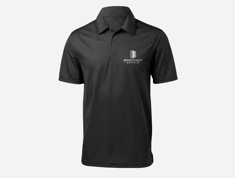
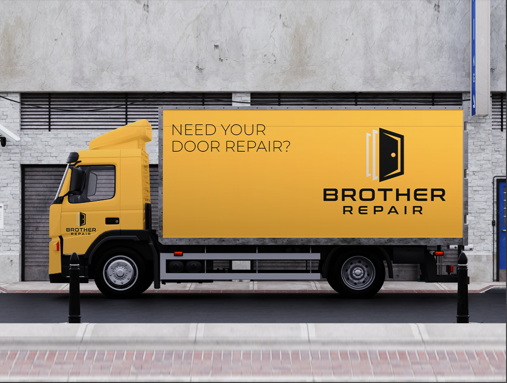
The fact that there are three brothers who own the business inspired the idea for this logo. One of their specifications was that the logo represents their teamwork in an original way. As a result, the three doors represent not only their friendship and ownership of the business but also their skill in commercial door maintenance and repair.
The color scheme of the logo was carefully chosen to reflect the professionalism and reliability of Brother Repair. The bold font used for the company name adds a sense of strength and expertise, further emphasizing their commitment to providing top-notch service in the industry.
Logo Inspiration: Three Doors = Three Brothers

Logo Version 2
In design iteration two, I wanted to create a logo that would give the brothers another option to pick from. The initial letters of the three brothers' surnames appear in this logo. They are combined not just artistically, but also chronologically, from oldest to youngest.
In design iteration two, I wanted to create a logo that would give the brothers another option to pick from. The initial letters of the three brothers' surnames appear in this logo. They are combined not just artistically, but also chronologically, from oldest to youngest.
This design choice emphasizes the brothers' unity and collaboration, highlighting their mutual commitment to quality in their work. The sleek and modern typeface employed for the initials provides a professional touch to the design, improving its appeal even further.
Logo Inspiration: The Three Brothers Initials = W I R
